
Begin with what people should remember
Before choosing color or type, ask what your brand offers, who it serves and why that audience would choose it. Those answers give design a purpose. A calm, confident business need not shout to stand out; it needs an expression that fits and can grow with it.
Build a system around the mark
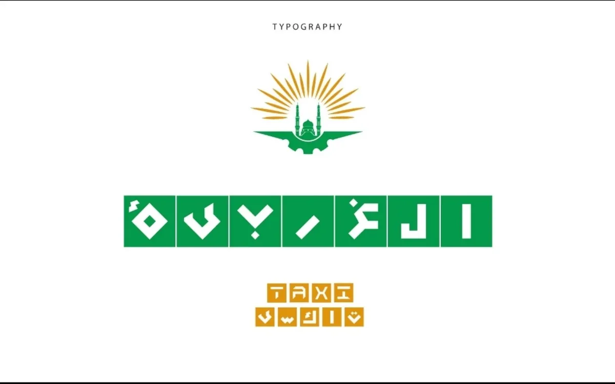
Identity includes color, typography, imagery, composition and tone of voice. Its value becomes visible when those parts work together across packaging, content and a website, even when the logo is not the main feature. Establish clear rules with room for variation.
Test everyday applications
Try small sizes, different backgrounds and a single color. Review Arabic and English layouts across print and screens. Practical applications reveal issues a presentation board may hide: unreadable type, weak contrast or detail that disappears at small sizes.
Hand over a way of working
A concise guide to color, type, spacing and usage helps everyone maintain consistency. Start with the most frequent applications and expand the system as the business needs change. Those details make an identity usable, rather than simply attractive.